For quite some time I was pretty confident that Weblate will need some UI rewrite at some point. This is always problematic thing for me as I'm no way an UI designer and thus I always hope that somebody else will do that. I've anyway spent few hours on train home from LinuxTag to check what I could do with that.
The first choice for me was to try Twitter Bootstrap as I've quite good experience with using that for UI at work, so I hoped it will work quite well for Weblate as well. The first steps went quite nicely, so I could share first screenshots on Twitter and continue to work on that.
After few days, I'm quite happy with basic parts of the interface, though the most important things (eg. the page for translating) are still missing. But I think it's good time to ask for initial feedback on that.
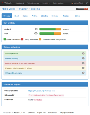
Main motivation was to unite two tab layout used on main pages, which turned out to be quite confusing as most users did not really get into bottom page of the page and thus did not find important functions available there. So all functions are accessible from top page navigation, either directly or being in menu.
I've also decide to use colors a bit more to indicate the important things. So the progress bars are more visible now (and the same progress bar now indicates status of translation per words). The quality checks also got their severity, which in turn is used to highlight the most critical ones. The theme will probably change a bit (so far it's using default theme as I did not care much to change that).
So let's take a look at following screenshot and let me know your thoughts:
You can also try that yourself, everything is developed in the bootstrap branch in our Git repository.


